Website & Brand Refresh | B.professionals

B.professionals is a recruitment agency with strong expertise in the public sector. They focus on creating meaningful matches between candidates and organizations, with a personal and people-first approach.

The goal of this project was to translate that personal, energetic identity into a clear and consistent digital presence across website and LinkedIn.

Project Context

B.professionals positions itself as a recruitment partner that “opens doors that normally stay closed.” Their strength lies in deep knowledge of the public sector and a strong focus on long-term, meaningful matches.

However, their digital presence did not fully reflect this personality and expertise. The website and LinkedIn communication needed more structure, consistency and visual clarity.

The objective was to modernize and unify the brand experience while keeping its human and approachable character.
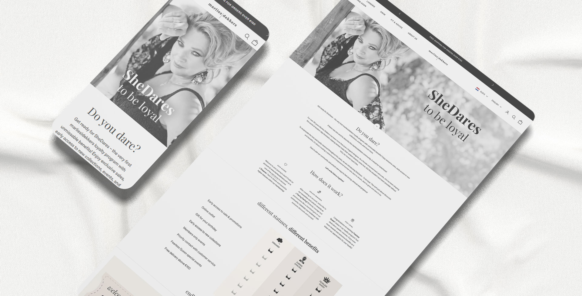
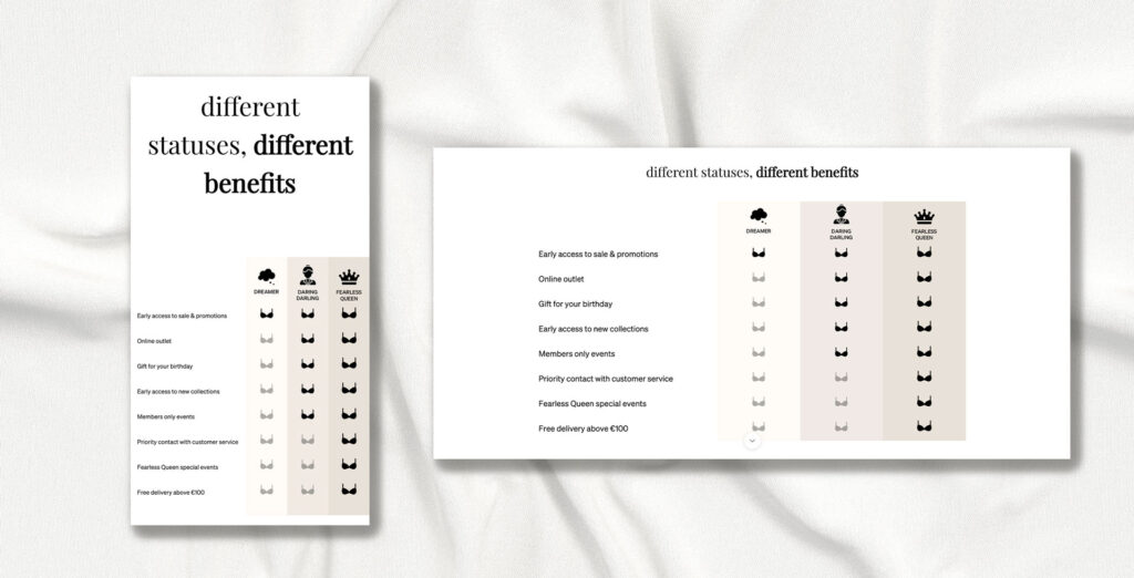
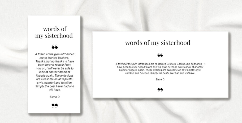

Website Design

Designed in Figma and developed in WordPress in collaboration with a developer. The new structure focuses on clarity and trust for both candidates and organizations.

Improvements included:

  • A clearer vacancy overview page
  • A dedicated page for opdrachtgevers (employers)
  • Stronger storytelling around the team
  • Structured presentation of services
  • Integration of articles and initiatives such as Trees for All

The website now better reflects the company’s personality: personal, direct and people-oriented.

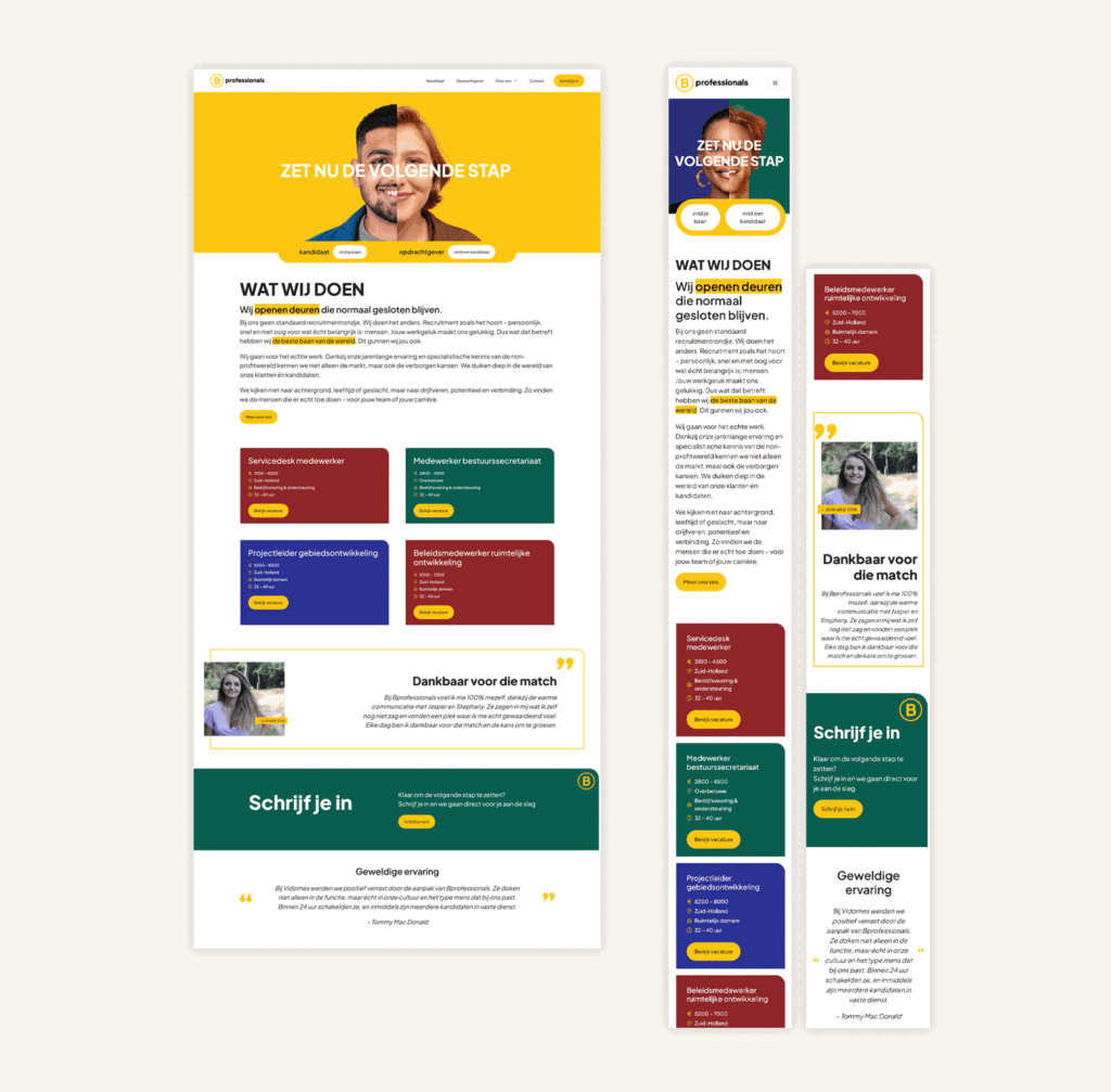
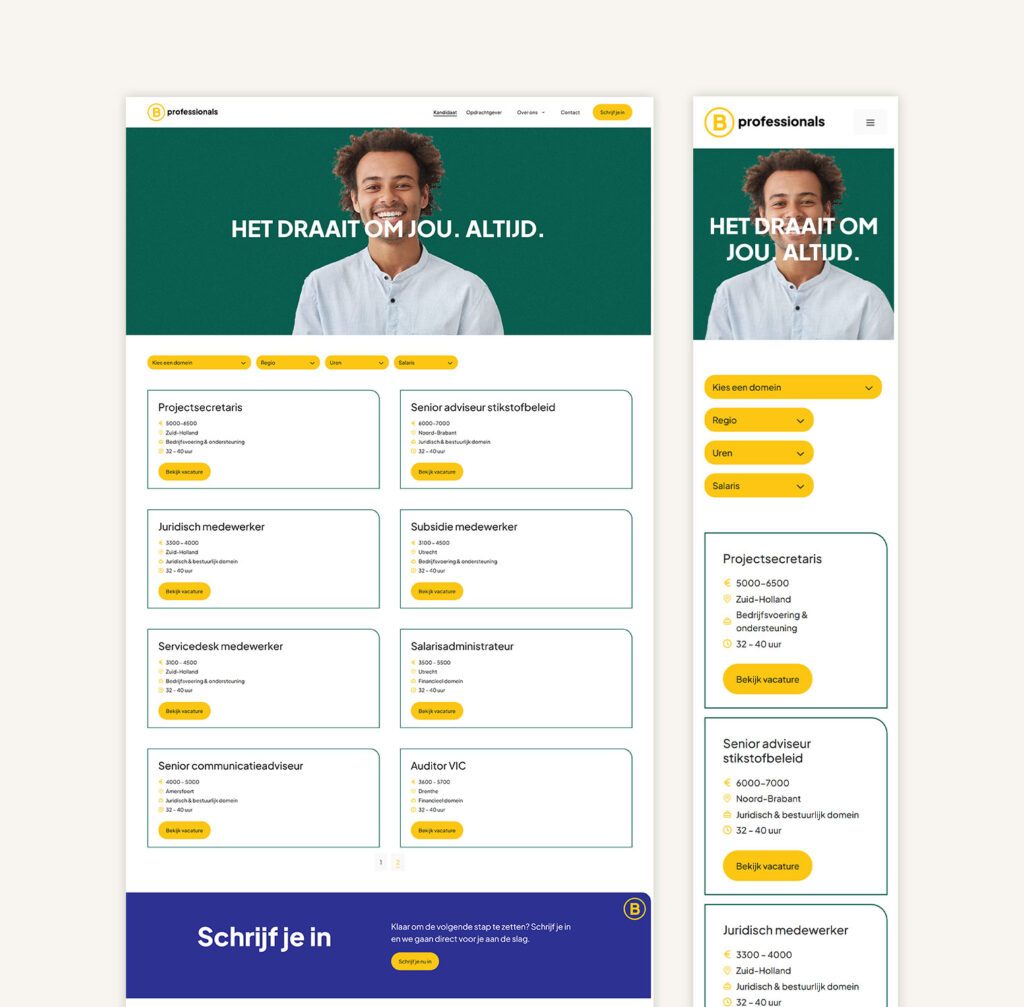
Structured vacancy overview with improved readability and filtering to support easier navigation.

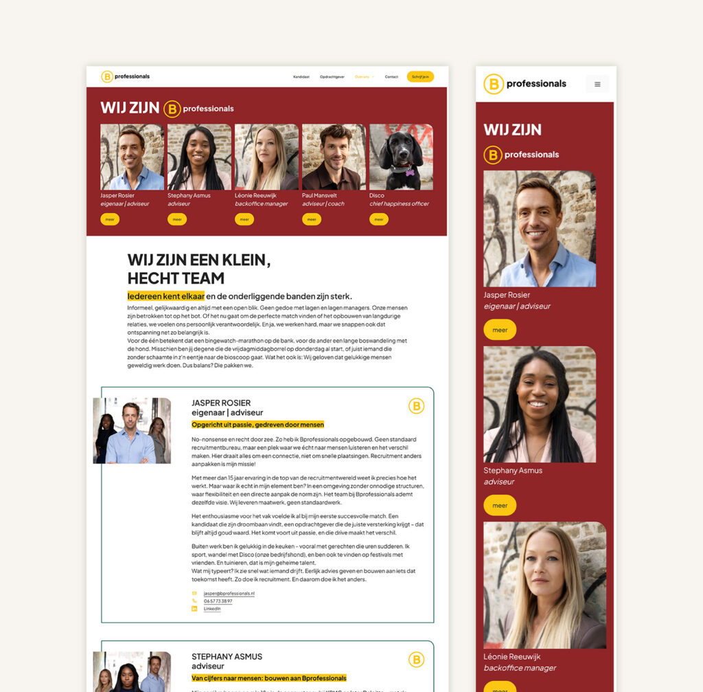
Human-centered storytelling through team visibility.

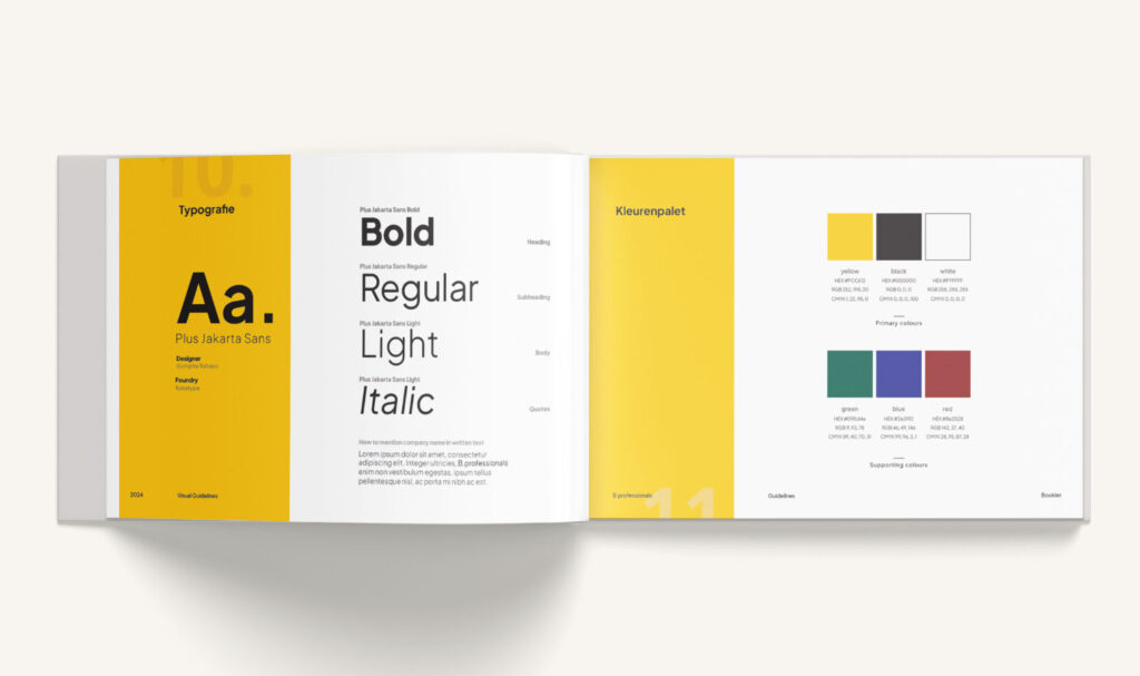
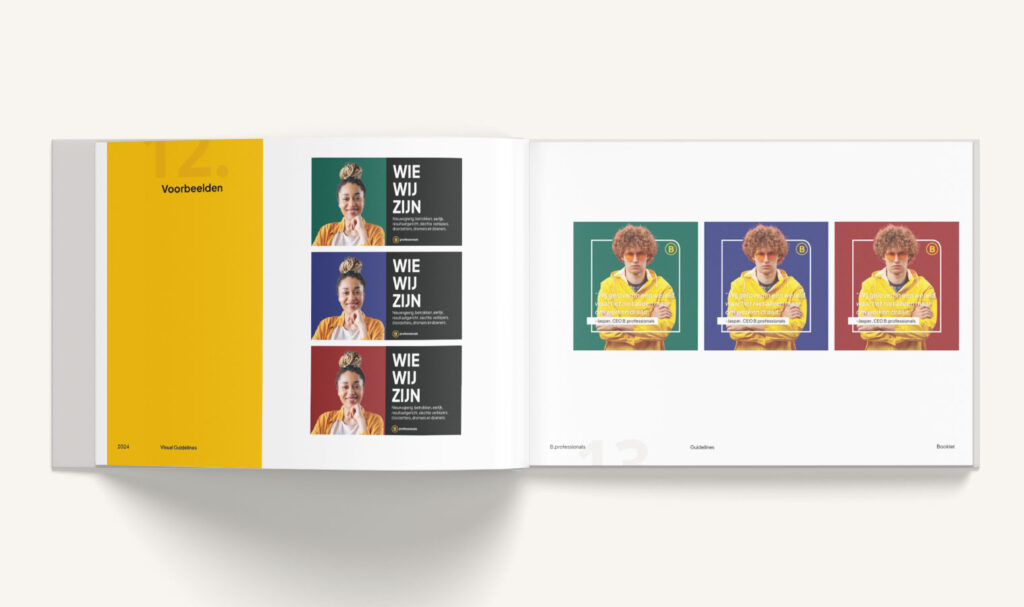
Brand System Refinement

The logo remained unchanged, but the visual system was expanded and structured.

  • Added supporting brand colors
  • Defined typography hierarchy
  • Established consistent spacing and layout rules
  • Created reusable design components

This ensured that the brand feels recognizable and cohesive across all digital touchpoints.

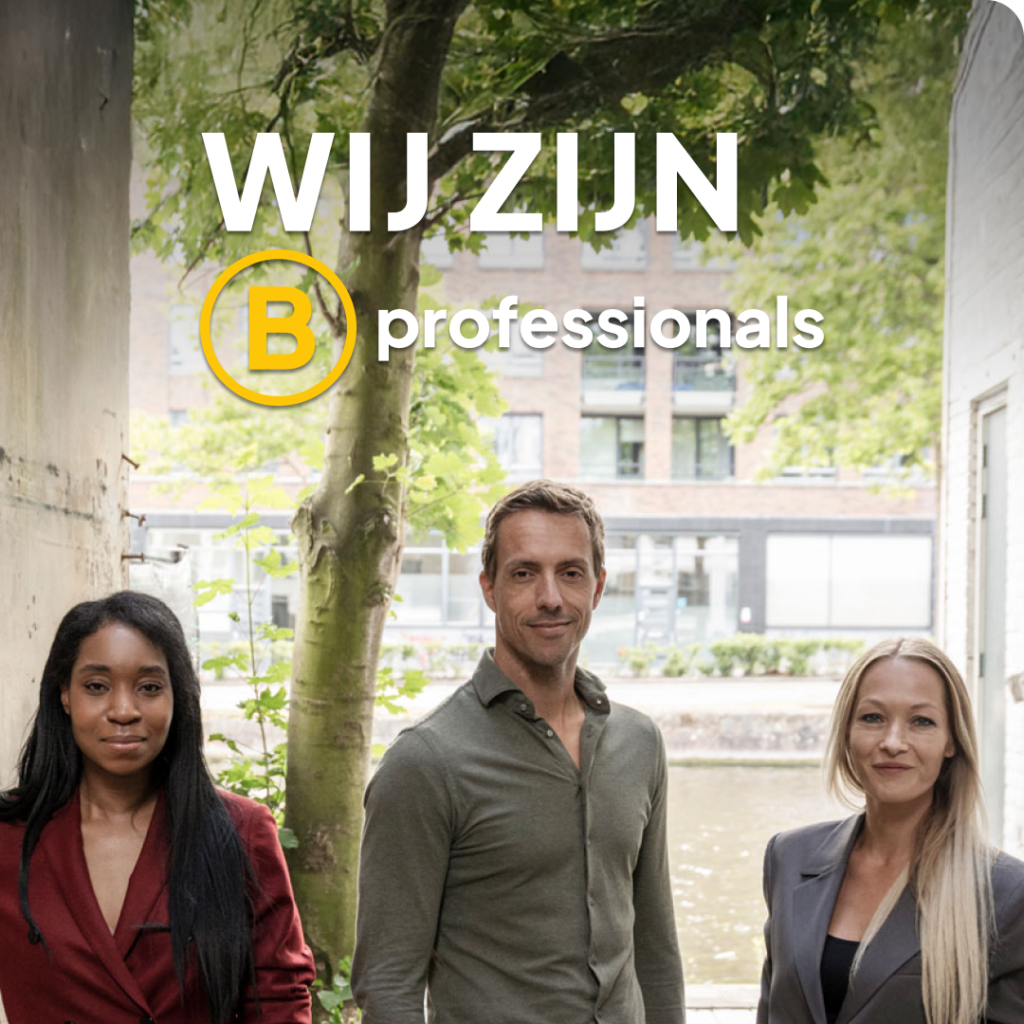
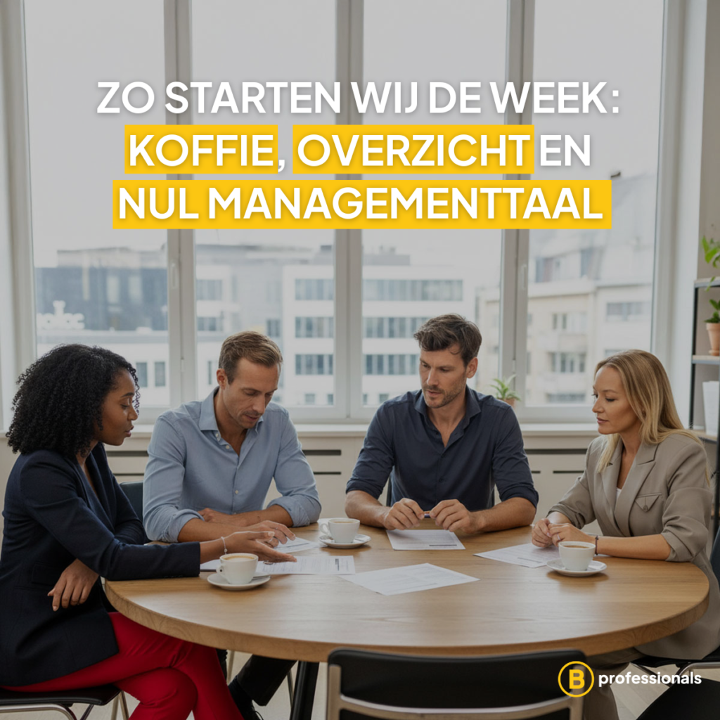
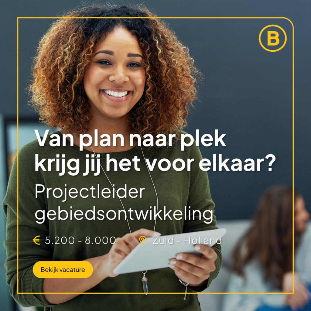
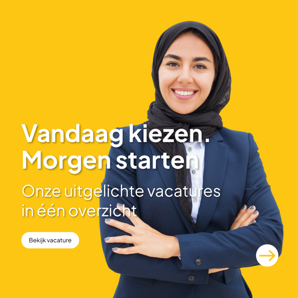
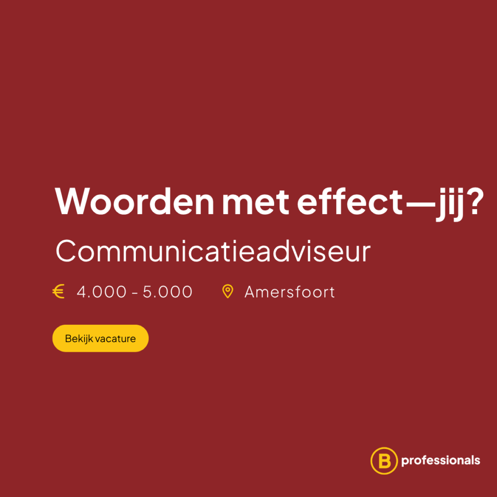
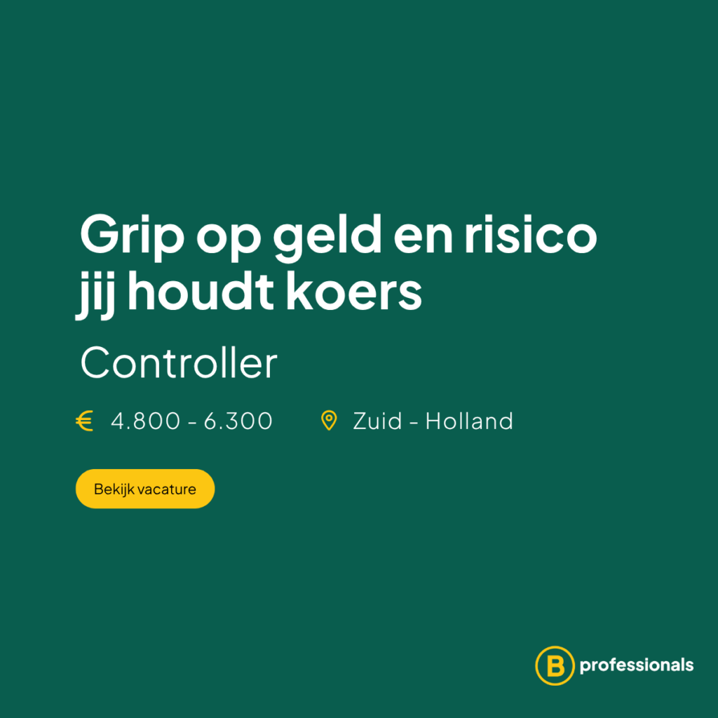
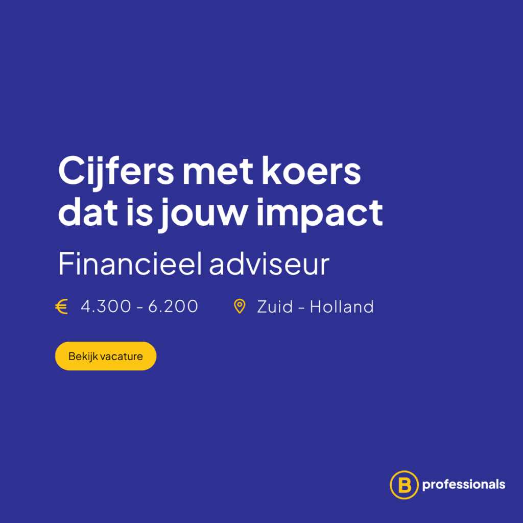
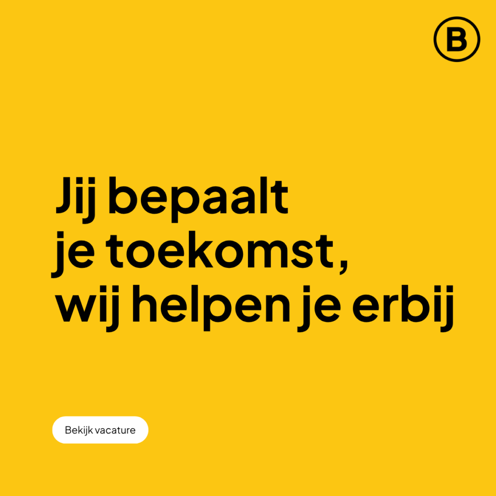
LinkedIn Communication

To strengthen their online presence, a structured LinkedIn visual system was developed.

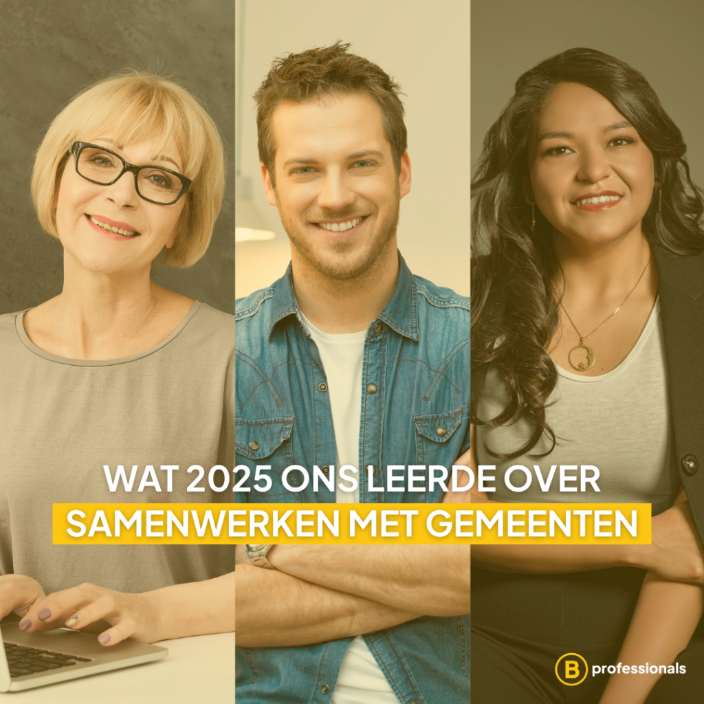
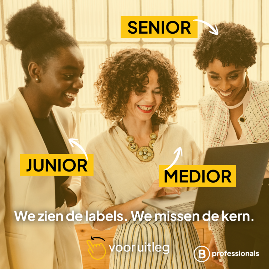
Content types included:

  • Vacancy announcements
  • Insights and recruitment statistics
  • Team stories
  • Informative carousels about working in the public sector
  • Seasonal campaigns and milestone videos
  • Playful AI-generated visuals to increase engagement

The aim was to balance professionalism with personality, keeping communication informative but approachable.

Impact

The project resulted in a more consistent and confident digital presence. The website now clearly communicates who B.professionals is, how they work and what makes them different.

Across website and LinkedIn, the brand now feels aligned with its core message: personal recruitment with real impact.

This project was created for B.professionals. All photography and written content are the property of the company and are displayed here for portfolio presentation purposes only.

Optimizing the Fit & Size Guide

The Fit & Size Guide had grown over the years and became a mix of different layouts and structures. During the migration to Shopify, this was a good moment to improve clarity and bring everything into one consistent system.

The goal was not to redesign everything visually, but to make the guide easier to understand, easier to use and help customers move confidently from learning to shopping.

Project Context

The brand works in the luxury lingerie and swimwear segment, where fit and style clarity are very important. The Fit & Size Guide includes several educational sections: bra shape explanations, measuring instructions, care guidance and size information.

Because the platform changed, all pages had to be rebuilt. This gave the opportunity to simplify the structure and make the experience more consistent across devices.

The Challenge

Customers frequently struggled with:

  • Understanding differences between bra categories (balcony, plunge, push-up, demi, etc.)
  • Scanning technical explanations
  • Navigating multiple educational pages
  • Connecting style explanations to real product visuals

Design Approach

The focus was on improving structural clarity while maintaining the established brand identity.
Key improvements included:

  • Standardizing layout across bra categories
  • Introducing modular content blocks
  • Improving hierarchy between educational content and commercial CTAs
  • Replacing abstract technical illustrations with model-based visual clarity
  • Optimizing content flow for mobile-first readability

Standardized bra category module.

Educational Structuring

To make the content easier to scan, long texts were divided into collapsible sections. Each bra category page now follows a clear structure: At the top, users see a concise technical explanation of the bra type (for example: What is a balcony bra?). This section explains the cut, support structure and visual characteristics. Below that, an accordion brings together selected FAQ questions from across the website that are specifically related to that bra style. Instead of users searching through different help pages, the most relevant questions (such as differences between balcony and full cup bras) are grouped directly under the category.

This creates a layered learning experience:

  • First: understand the style
  • Then: explore specific questions
  • Finally: move to relevant products

Under the educational content, a recommended product carousel displays matching balcony bras. This directly connects learning to action, supporting both customer confidence and conversion. The modular structure makes the system scalable across all bra categories and allows future updates without redesigning the full page.

Instructional Flow

The measurement page was redesigned to combine clear step-by-step instructions with strong visual support. The layout was simplified to make the steps easier to follow, especially on mobile.

Implementation Within Shopify

The system was built using modular Shopify sections to ensure consistency and scalability. Reusable content blocks were structured to allow efficient updates and future integration. The redesign focused on optimizing clarity within platform limitations while preserving brand consistency.

This project was created as part of my role at marlies|dekkers. All brand assets and imagery belong to their respective owners and are displayed here for portfolio purposes only.

Loyalty Program UX & UI Design

She Dares is Marlies Dekkers’ first membership program, designed to reward loyal customers with exclusive perks, early access to collections, and unique experiences. The goal was to create a structured, engaging, and accessible loyalty program that reflects the brand’s ethos of female empowerment and community.

Role
I served as UX/UI Designer, Art Director, and Designer, collaborating with the cross-functional team to define membership tiers, naming conventions, and tier progression criteria. Together, we brainstormed and shaped the program to ensure it was clear, motivating, and aligned with the brand’s values—all while staying within budget.

Challenge
The main challenge was designing a loyalty program without additional development resources. Traditional points-based systems were not feasible, so we needed an alternative way to differentiate the three tiers. We decided to base progression on purchase frequency, number of transactions, and total spend, creating a system that was transparent, fair, and easy to understand.

Research & Insights
We collected insights from multiple departments to map existing customer benefits, such as birthday discounts, early access to sales, and exclusive communications. These perks were organized into the three tiers, allowing us to present all existing benefits as a cohesive, aspirational program. This approach ensured a rewarding experience for users without the need for complex new developments.

Design Process
The user journey was mapped from registration to tier progression, emphasizing clarity and motivation. Wireframes and interactive prototypes were created in Adobe XD, iteratively refined through feedback loops. Key findings included the importance of making tier benefits immediately understandable and visually distinct to drive engagement and excitement.

Outcome
The final She Dares loyalty program is structured, user-friendly, and well-received by the community. New members immediately engaged with the perks through registration discount codes, which successfully encouraged repeat purchases. Early feedback confirmed that the program enhanced user satisfaction and brand loyalty. Future improvements will focus on more integrated communication across the website, app, and physical stores as budget allows.