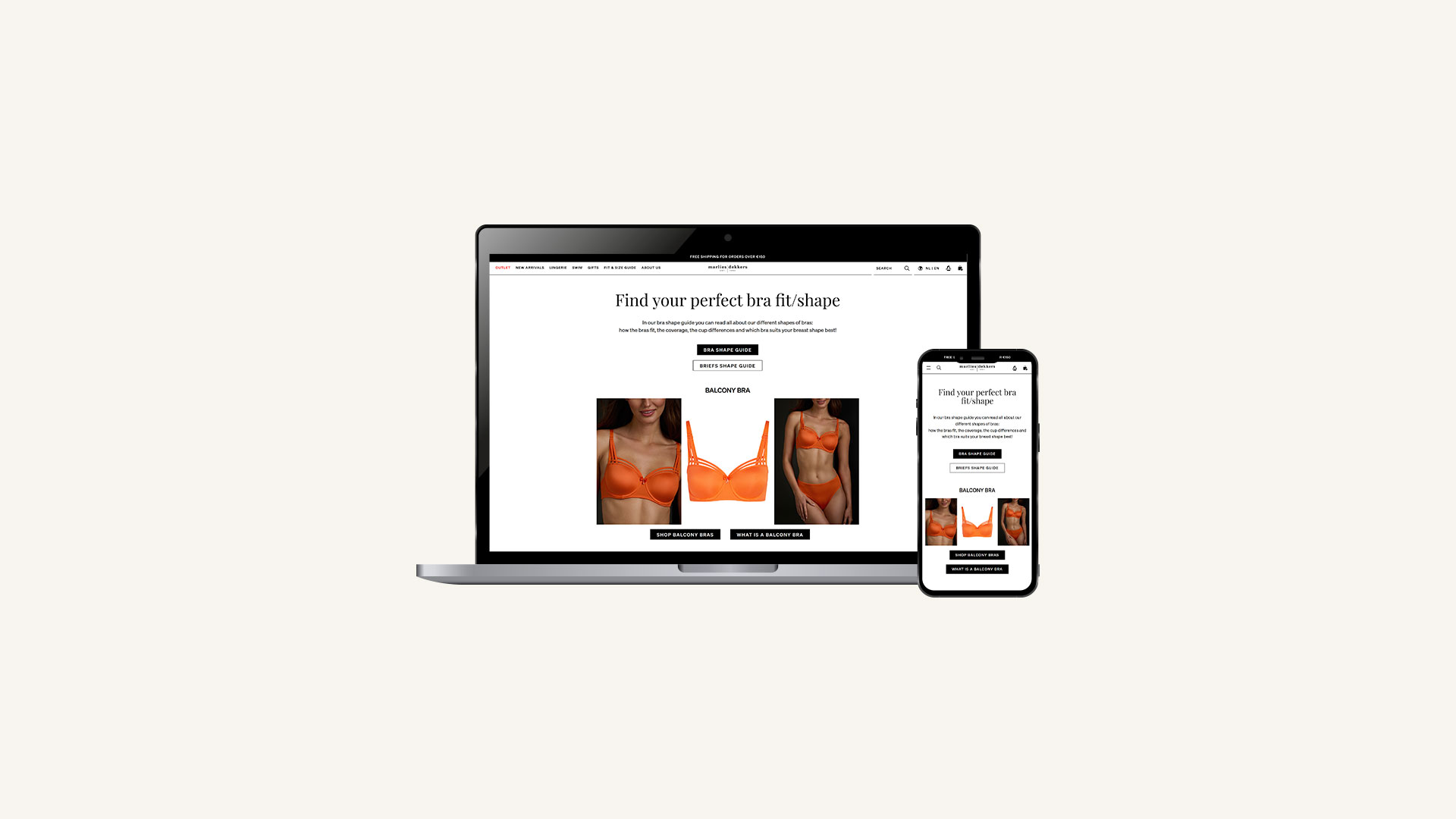
The Fit & Size Guide had grown over the years and became a mix of different layouts and structures. During the migration to Shopify, this was a good moment to improve clarity and bring everything into one consistent system.
The goal was not to redesign everything visually, but to make the guide easier to understand, easier to use and help customers move confidently from learning to shopping.
Project Context
The brand works in the luxury lingerie and swimwear segment, where fit and style clarity are very important. The Fit & Size Guide includes several educational sections: bra shape explanations, measuring instructions, care guidance and size information.
Because the platform changed, all pages had to be rebuilt. This gave the opportunity to simplify the structure and make the experience more consistent across devices.
The Challenge
Customers frequently struggled with:
- Understanding differences between bra categories (balcony, plunge, push-up, demi, etc.)
- Scanning technical explanations
- Navigating multiple educational pages
- Connecting style explanations to real product visuals
Design Approach
The focus was on improving structural clarity while maintaining the established brand identity.
Key improvements included:
- Standardizing layout across bra categories
- Introducing modular content blocks
- Improving hierarchy between educational content and commercial CTAs
- Replacing abstract technical illustrations with model-based visual clarity
- Optimizing content flow for mobile-first readability
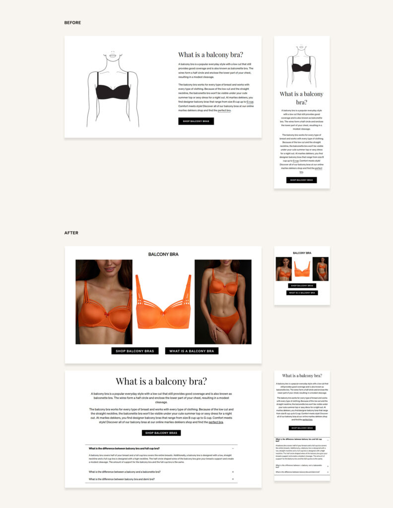
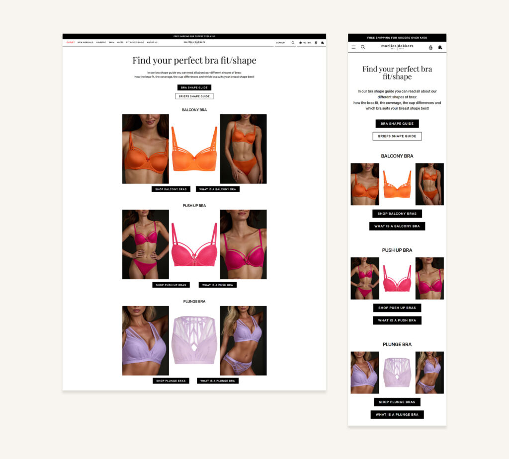
Standardized bra category module.
Educational Structuring
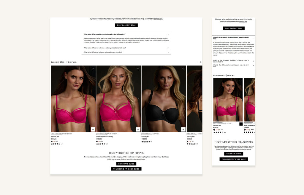
To make the content easier to scan, long texts were divided into collapsible sections. Each bra category page now follows a clear structure: At the top, users see a concise technical explanation of the bra type (for example: What is a balcony bra?). This section explains the cut, support structure and visual characteristics. Below that, an accordion brings together selected FAQ questions from across the website that are specifically related to that bra style. Instead of users searching through different help pages, the most relevant questions (such as differences between balcony and full cup bras) are grouped directly under the category.
This creates a layered learning experience:
- First: understand the style
- Then: explore specific questions
- Finally: move to relevant products
Under the educational content, a recommended product carousel displays matching balcony bras. This directly connects learning to action, supporting both customer confidence and conversion. The modular structure makes the system scalable across all bra categories and allows future updates without redesigning the full page.
Instructional Flow
The measurement page was redesigned to combine clear step-by-step instructions with strong visual support. The layout was simplified to make the steps easier to follow, especially on mobile.
Implementation Within Shopify
The system was built using modular Shopify sections to ensure consistency and scalability. Reusable content blocks were structured to allow efficient updates and future integration. The redesign focused on optimizing clarity within platform limitations while preserving brand consistency.
This project was created as part of my role at marlies|dekkers. All brand assets and imagery belong to their respective owners and are displayed here for portfolio purposes only.